In today’s digital landscape, mobile optimization has become a crucial aspect of web design and development. With the increasing number of consumers using smartphones and tablets to browse the internet, businesses must ensure their websites are mobile-friendly. A mobile-optimized website not only enhances user experience but also plays a significant role in search engine rankings.
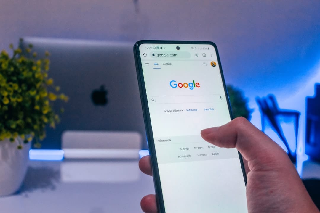
Google, for instance, prioritizes mobile-friendly sites in its search results, meaning that if your website isn’t optimized for mobile devices, you could be missing out on valuable traffic and potential customers. Moreover, a well-optimized mobile site can lead to higher conversion rates. When users can easily navigate your website on their mobile devices, they are more likely to engage with your content, make purchases, or contact your business.
On the other hand, a poorly designed mobile site can frustrate users, leading them to abandon their search and turn to competitors. Therefore, investing in mobile optimization is not just a trend; it’s a necessity for small business owners looking to thrive in a competitive market.
Key Takeaways
- Mobile optimization is crucial for business websites to ensure a seamless user experience on all devices.
- Mobile traffic has a significant impact on businesses, with more users accessing websites through mobile devices than ever before.
- Key factors for mobile-friendly website design include responsive layout, fast loading times, and easy navigation.
- Improving mobile user experience can be achieved through clear call-to-action buttons, simplified forms, and streamlined checkout processes.
- Utilizing responsive design for your website is essential to ensure that it adapts to different screen sizes and devices for a consistent user experience.
Understanding the Impact of Mobile Traffic on Your Business
Mobile traffic has surged in recent years, and understanding its impact on your business is essential. According to various studies, over half of all web traffic now comes from mobile devices. This shift means that if your website isn’t optimized for mobile users, you could be alienating a significant portion of your audience.
For small businesses in Nottingham, this is particularly important as local consumers increasingly rely on their smartphones to find services and products nearby. Additionally, mobile users often exhibit different behaviors compared to desktop users. They tend to seek quick information and expect fast loading times.
If your website takes too long to load or is difficult to navigate on a mobile device, you risk losing potential customers. By recognizing the importance of mobile traffic and adapting your website accordingly, you can create a more engaging experience that meets the needs of today’s consumers.
Key Factors for Mobile-Friendly Website Design

Creating a mobile-friendly website involves several key factors that small business owners should consider. First and foremost is responsive design, which allows your website to adapt seamlessly to different screen sizes. This means that whether a user is accessing your site from a smartphone, tablet, or desktop computer, they will have a consistent and enjoyable experience.
Responsive design not only improves usability but also helps with SEO, as search engines favor sites that provide a good user experience across all devices. Another important factor is the simplicity of navigation. Mobile users appreciate straightforward menus and easy-to-find information.
Complicated navigation can lead to frustration and increased bounce rates. It’s essential to prioritize the most important content and make it easily accessible. Additionally, optimizing images and reducing file sizes can significantly improve loading times on mobile devices.
By focusing on these key factors, you can create a mobile-friendly website that enhances user experience and drives engagement.
Strategies for Improving Mobile User Experience
Improving the mobile user experience requires a thoughtful approach that considers the unique needs of mobile users. One effective strategy is to streamline content by focusing on essential information and eliminating unnecessary clutter. Mobile users often seek quick answers, so presenting information in a clear and concise manner can enhance their experience.
Utilizing bullet points, short paragraphs, and engaging visuals can help convey your message effectively without overwhelming users. Another strategy is to implement touch-friendly elements. Since mobile users interact with their devices using their fingers, buttons and links should be large enough to tap easily without accidental clicks.
Additionally, incorporating features like click-to-call buttons can facilitate communication with potential customers directly from their mobile devices. By prioritizing these strategies, you can create a more enjoyable and efficient experience for your mobile audience.
Utilizing Responsive Design for Your Website
Responsive design is an essential component of modern web development that ensures your website looks great and functions well on any device. This approach involves using flexible grids and layouts that automatically adjust based on the screen size. For small business owners in Nottingham, adopting responsive design can significantly enhance user experience and improve search engine rankings.
One of the primary benefits of responsive design is that it eliminates the need for separate mobile and desktop versions of your website. This not only saves time and resources but also ensures that all users receive the same content and functionality regardless of their device. Furthermore, responsive design can improve loading times, as it optimizes images and other elements for different screen sizes.
By investing in responsive design, you can create a cohesive online presence that caters to all users effectively.
The Role of Mobile SEO in Attracting Local Customers

Mobile SEO plays a vital role in attracting local customers to your business. As more people use their smartphones to search for local services, optimizing your website for mobile search is essential for visibility. This includes ensuring that your site loads quickly on mobile devices, using local keywords effectively, and creating content that resonates with your target audience.
Incorporating local SEO strategies can help you connect with potential customers in Nottingham who are searching for businesses like yours. This might involve optimizing your Google My Business listing, encouraging customer reviews, and ensuring your contact information is easily accessible on your mobile site. By focusing on mobile SEO, you can enhance your online presence and attract more local customers who are ready to engage with your business.
Mobile Payment Solutions for Nottingham Businesses
As mobile commerce continues to grow, offering convenient payment solutions is crucial for small businesses looking to thrive in Nottingham’s competitive market. Mobile payment options such as Apple Pay, Google Wallet, and other digital wallets provide customers with a seamless checkout experience. By integrating these solutions into your website or physical store, you can cater to the preferences of tech-savvy consumers who value convenience.
Additionally, implementing secure payment gateways is essential for building trust with your customers. Ensuring that transactions are safe and secure will encourage more people to make purchases through their mobile devices. If you’re unsure about how to set up these payment solutions or want to ensure they are integrated correctly into your website, consider reaching out to professionals like Make my Web who specialize in web design and e-commerce solutions.
Tracking and Analyzing Mobile Traffic for Business Growth
To truly understand the impact of mobile optimization on your business, it’s essential to track and analyze mobile traffic effectively. Utilizing tools like Google Analytics can provide valuable insights into how users interact with your site on mobile devices. You can monitor metrics such as bounce rates, average session duration, and conversion rates specifically for mobile users.
By analyzing this data, you can identify areas for improvement and make informed decisions about your marketing strategies. For instance, if you notice high bounce rates on certain pages, it may indicate that those pages are not optimized for mobile users or lack engaging content. Regularly reviewing this data allows you to adapt your approach continually and ensure that you’re meeting the needs of your audience effectively.
In conclusion, optimizing your website for mobile users is no longer optional; it’s a necessity for small business owners looking to succeed in today’s digital landscape. From understanding the impact of mobile traffic to implementing responsive design and tracking analytics, there are numerous strategies you can employ to enhance user experience and drive growth. If you find yourself facing challenges in this area or simply want expert guidance, consider reaching out to Make my Web for professional assistance tailored to your business needs.